Wednesday, 21 April 2010

Website Design


This is the design for our website Homepage, which I put together based on our research here and into other band websites. The Design puts the pictures of the band at the forefront, which is typical of the websites of bands like The Auteur, whilst also continuing the comic book aesthetic which we have adopted as a brand for the band. Also prominent are the bands Web 2.0 Social Media presences (MySpace, Twitter, Facebook & YouTube) to reflect the convention for bands of this type to be extremely involved with their audience.

It is rendered slightly larger than it would be on a web page, as the size is scalable.

Final DVD Cover


This is the final design for the front and rear packaging of the Music Video DVD (Digipack). It was initially designed and lain out by Amy Neumann, who also chose the pictures etc. The layout was then finalised by me (Paul) after I added the text, logos etc.

Tuesday, 20 April 2010

DVD Packaging Rough Designs


These are some rough designs Amy drew whilst she and I were planning the design for the digipack. The final cover design will be a combination of the two covers shown here, using the approximate back cover of one and a front design based on the other. A rough layout for a disc face was also planned.

Tuesday, 30 March 2010

Hey! Watch this... Music Video Final Cut


This is the final cut of our music video, with final sound mix & completed effects. It's available on Blogger, blip.tv and YouTube to ensure it can be seen regardless of technical issues.

Analysis of The Auteur's Web Presence

The Auteur, typically for a modern band signed to an indie label, promotes itself primarily through Web 2.0 sites such as MySpace, Facebook and YouTube. This allows the band to interact more directly with their fanbase, which is critical for smaller bands.
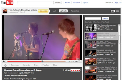


The band's YouTube Channel consists primarily of live videos of the band performing, which is important in attracting the target audience as the generic conventions of rock place a strong emphasis on performance aspects. By posting these kinds of videos, the band plays up their image as a genuine rock package - with a modern edge, because they're web-savvy.

The band's MySpace puts the music and the records at the fore. The first thing seen upon visiting is the band logo represented in large proportions, connoting an image of scale and importance that an indie band like The Auteur might not otherwise be able to connote so immediately.


Surrounding the page are tiled photographs of the band hanging out and mucking around. This, again, appeals very much to the target audience of (Predominately) young adults and teens. Scattered in amongst these pictures are photographs of the band's instruments, teasing that where the band goes, rock follows.

The MySpace page allows fans and potential fans to sample the band's latest music and provides links to buy both it and band merchandise. Additionally, the page promotes the band member's Twitter pages (Promoting fan interaction with the band themselves, creating a friendly, approachable image) and encourages fans to get involved with grass roots efforts to promote the band (Often referred to as "Street Teaming" in Pop Music industry parlance).

The design of the MySpace Page is understated other than the large logo and the scattered photographs behind the main content. It uses a plain but attractive blue/black on white design. This use of simple colour pallets is generically conventional for rock band promotions, as labels tend to use a specific set of 3-4 colours to represent a band's image.

The band's Facebook page is significantly smaller in terms of followers ("Fans" in Facebook parlance, "Friends" in MySpace's). However, this is not entirely a disadvantage, as Facebook Fans are more likely to recommend things they see on the band's page to their friends, as Facebook has built-in sharing features.


The Facebook does allow the sampling of tracks, but is used mostly to communicate with the band's core following, promoting events the band are playing live & so on, as well as supplying the fans with a healthy supply of pictures to get excited about.

In designing our website, we will take some cues from the band's existing web presence. For example, the site will promote fan interaction and will put the band's content and performances at centre stage. This strategy is the best for connecting with the market of teens and young adults, who tend to be more web-savvy and prefer to learn about music through the internet (And usually purchase music this way as well - af act which aids bands like The Auteur as digital downloaders are more likely to make impulse music buys).

Friday, 26 March 2010

Photo Editing

Lewis used photoshop to edit an picture of a band member.


The original:


The Edit:


Wednesday, 17 March 2010

Photography

We took photographs of our band members out and about.
These photos will be used on their website and also the CD /DVD cover.

Thursday, 11 March 2010

Manga


We've decided to have a brief look at Manga because it is a comic book equivalent in Japan.

Here is a video of Amy drawing an anime/manga character.
http://www.youtube.com/watch?v=pWwlxJXSMi4
http://www.youtube.com/user/conebe#p/u/4/93CI-Vw5f4Y

Thursday, 4 March 2010

How to draw comic book characters


I thought that it would be useful to research how we would draw our own comic book characters. It is a possibility that we create our band members as comic figures for our digi-pack.


Comic Book / Digipack Research

This is our mood board / collection of comic book images and pages. We did this as research for our digipack and will help inform the way our final design will look.

In our video we've used fonts, speech bubbles, boxes, etc... that we found were common in the comic book style.

Wednesday, 3 March 2010

Digipack Research: Analysis of "Riot!" Cover


This album cover is very much like a scribble from a sketch book. The word 'Riot!' which is the album title is bright orange and a larger scribble than the others words. If you look closely you will notice that the words are infact the credit of the album.

The album title is the main text and is central to the cover, the picture of the band is also sketch like, as they are in black and white. The image is directly below the title, drawing attention to both.

The band name 'Paramore' is not featured on the album cover itself, it is however written on the hinge of the CD case. This is down to the band being popular and their image alone is enough for fans to recognise them.


Thursday, 4 February 2010

Additional Dialogue

After looking at our audience feedback we decided to add some extra dialogue to the opening narrative sequence. We decided to do this because the feedback suggested that the opening was too quiet and this made it boring.

The dialogue will be added to the third scene in the sequence to flesh out the narrative of the couple having issues & to explain more clearly why the girl decides to slap the singer & leave.

We will also be adding some sound effects to the first part of the sequence to explain why the singer leaves. We may also add an audible sigh to make the girl's reaction clearer.

We will be recording the dialogue sometime next week.

Wednesday, 27 January 2010

Plans for Stylistic Effects

In order to better differentiate between the narrative and performance scenes in our video, we have decided to apply spcific and unique titling & effects to each. We took our inspiration for these from both research into videos aimed at our target demographic (Males, predominately teens & young men).

The first effect we are applying is to the performance sequence. This was filmed using "guerilla camerwork", which refers to a style of shooting designed to mimic the style of video produced by untrained videographers - eg. home movies and other no-professional videos. To accentuate the effect of this shooting style, we have chroma keyed in a custom-made video camera effect.

This effect features the kinds of graphics usually seen on a camcorder viewfinder or screen, such as a battery meter, date & frame indicator. This accentuates the impression that the band are an idnependent group of freinds who are just "jamming" in their attic for fun - which matches up with their character profile.

As for the narrative, we have decided to include titling & other text effects throughout in order to help the audience better follow the narrative. These captions & so on will be styled after a comic book, as these are a popular medium with our target demographic, and we feel the slightly comedic style created by doing this will strike a chord with our audience - to test this, we will be conducting a poll.

Both of these effects have been used in videos aimed at the same demographic as ours. This Eminem video, for example, whilst for a different genre of music, is also aimed at teenage boys and young adult males. Additionally, the Rap and Pop/Rock genres have, to some extent, shared origins in separate (Though related) youth rebellion movements.

Monday, 11 January 2010

Video Second Cut


This is the second cut of the video, which I'm making available so we can gain some audience feedback ahead of making the finishing touches. Transitions are near-final, as is the editing & timing. We have cut the opening scene for time. Captions and titling are still missing, as we're waiting until the final cut to add these.

Tuesday, 5 January 2010

Audience Feedback on the Rough Cut

We showed our rough cut video to our media class and asked for their opinions. We collected a list of good points, bad points and points of which to improve on.

Good:
- Use of camera shots/angles
- Balance of both narrative and performace scenes
- Colour tinting
- Correct costumes
- Entertainign and correct facial expressions

Bad:
- Lip syncing
- Intro is too long
- Didn't understand the intro
- Drum syncing
- Dark lighting in the attic
- Should have slapped Lewis harder

Improvements:
- Cut down the introduction
- Add or change the colour effects (one for the performance, one for the narrative)
- Sound dubbing